

Five rules in designing for a vulnerable population
For new readers, I’m working with the City of Austin Innovation Office to create MyPass, a digital storage platform funded by a grant with Robert Wood Johnson’s Foundation for people experiencing homelessness to upload, store and validate their identification documents.
Perhaps the most important rule of UX Design is to know your user. Who you’re designing for is just as important as the what or why.
Here are five things I’ve discovered through user research and user testing that are essential in designing for a vulnerable population. These are helpful to keep in mind when designing not only for people experiencing homelessness, but for vulnerable populations at large (any kind of user with cognitive disabilities and/or impairments.)
Caption (almost) every symbol

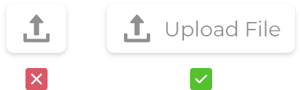
If you see this symbol, chances are you probably know it means “upload.” We use this and other variations of an upwards-facing arrow to communicate to the user that clicking this will allow them to upload a file.
At this point, we have pretty solid standards and guidelines for iconography. Even here on Medium, a quick search nets you some pretty great articles about it. Still, some rules have to be broken when designing for specific populations. For instance, when I tested this “Upload” symbol within MyPass version 0.1, few people understood that it was supposed to do.
They’re not to blame — not everyone has been conditioned by years of computer and phone usage to surmise such a meaning at a glance. What’s more, despite an increase of older Americans spending time in front of a digital screen, there is still a crowd out there that has yet to embrace technology as much as the rest of the population. This is especially true for those without a home. Many lack mobile phones and lose them easily in the streets.
Which brings me to my point: always caption symbols. Don’t assume that because you and I understand it, that the people you’re designing for will. In the case of MyPass and its pursuit of accessibility, captions are an absolute must in its iconography.
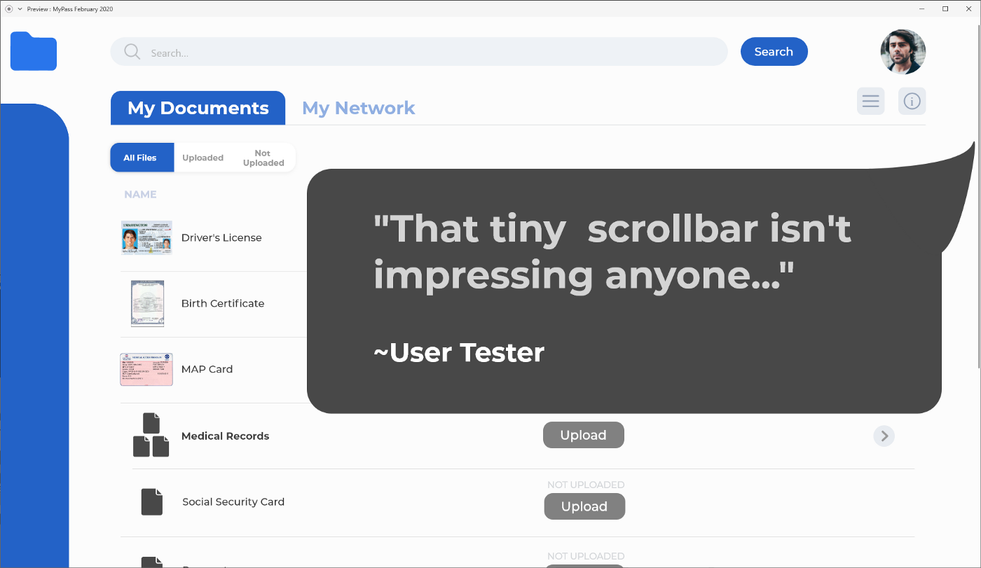
Pop-up windows help situate your user
Pop-ups have quickly become my go-to solution for helping people navigate through their different documents. The reason is simple: navigating through multiple files can get confusing. It’s easy to get lost in a sea of information and pop-up windows help frame your focus.
Take my first iteration of MyPass back in November of 2019:
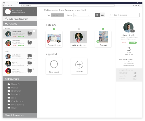
My original intention was to keep everything on one screen. After all, if there’s enough screen real-estate, why would I force my user to go through unnecessary clicks to see the details of a file?
Turns out, not only is it disorienting and confusing for the user to see everything at once, but it also creates a powerful dissonance between where they’ve been and where they want to go.
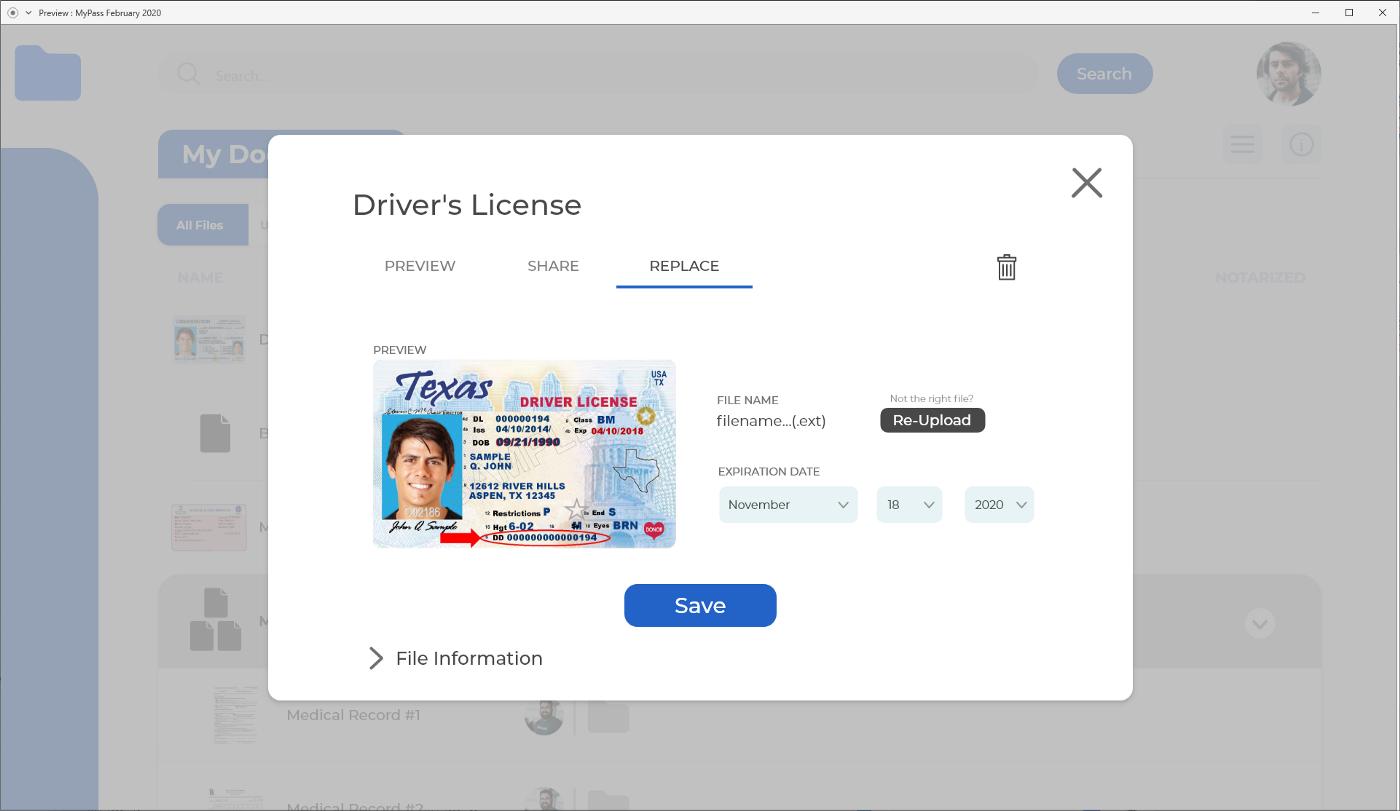
Which brings me to our current version.
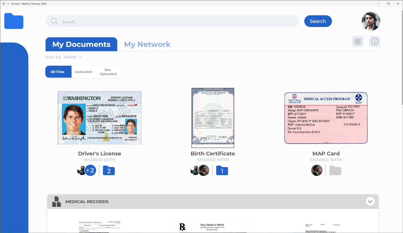
Everything works with pop-ups windows. If you click a particular file, it opens a new window. Not only does this give us more room to view and modify the file, but it also creates a very important trigger in your brain telling you “yes, you opened a thing!”
More importantly, it keeps your previous window in the background, giving you a peripheral vision of where you’ve been. It becomes much easier for users to understand where they are and where they’re going if you keep their journey visible on the screen.
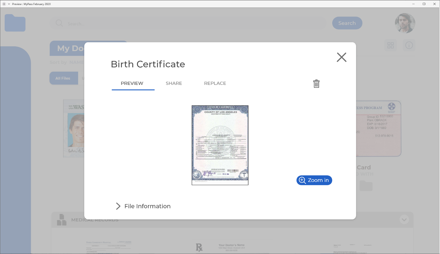
Be intentional about your visual hierarchy
Perhaps a very obvious component of any interface is the ‘X’ mark. I want to highlight the power of these intersecting lines because when combined with pop-up windows, they give your user immense flexibility and intuitiveness to jump back and forth between your screens.
Usability tests showed me just how important it is for the user to feel like they can back-track at all times. It also demonstrated the flip side of that coin, and where that little symbol gets a few more clicks than it should.
Despite the need for captions, most users, even the less tech-savvy ones, scan incredibly quickly to find what they’re looking for. The problem is, if they can’t, they’ll simply hit that X and look for it elsewhere, regardless of whether the thing they were looking for was there or not.
Rarely do users take the time to inspect every element in a window. This is where visual hierarchy becomes extremely important. The last thing you want to do is give that powerful symbol more visual prominence and have your users skim through important screens.
50% opacity? Maybe that’ll do the trick…
Taxonomy and information architecture also plays a role here. Tracking the words a user is looking for and making sure you use the most widely understood accepted terms is a crucial step in avoiding headaches and frustration.
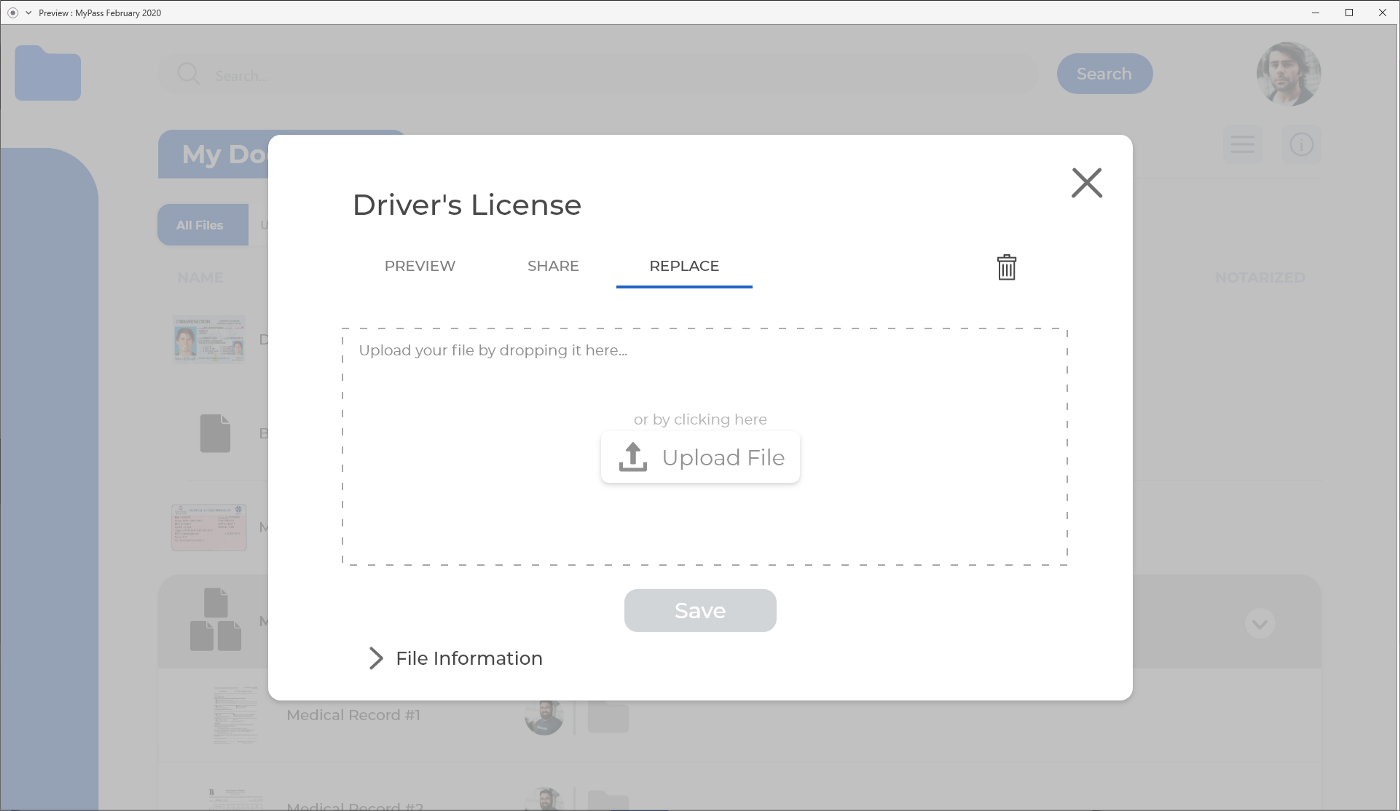
“Replace” for instance, was more unanimously understood than “Update” when looking to swap out an old document with a newer version.
Always show scrollbars
Scrollbars are an important part of any interface that has overflowing content. Apple has been slowly shrinking them off their interfaces over the years, and for a good reason… scrollbars are ugly.
Yet they are a necessary evil. They communicate very clearly to your user there’s more than fills the screen. If you’ve ever cringed at your grandmother clicking the bar and pulling it down rather than using the scroll wheel, you’re not alone, but this is what makes sense to her, and a lot of other people.
This rule is simple. Make scrollbars visible at all times. No exceptions.
Guide your user one step at a time
Perhaps the most important rule so far. DON’T overwhelm your users. There’s enough stress involved in re-acquiring and procuring IDs for them to feel like this is yet another form to fill.
Taking things slow and walking people through the process of uploading a file one step at a time is extremely important. If there is more than one required action or input (like titling a document or setting its expiration date), it’s better to separate those interactions in an ordered flow.
This design philosophy makes it drastically easier for a user to input information. Not only does it seem less daunting to go through dropdown menus and input fields one screen at a time, but it also helps users focus on one single task before moving onto the next.
It’s important when designing for a not-so-tech-savvy population, but it becomes essential when designing for a vulnerable one.
For more specific rules on optimizing the UX in forms, I recommend Andrew Coyle’s piece on it.
As for the future of MyPass, it’s looking bright. Each and every day we draw closer to having a polished, working program. You can follow the development progress here, or by reading about it on this blog.

