Color
Colors support the content hierarchy on a page and establish visual patterns to enhance or frame the user experience.
Color Palette
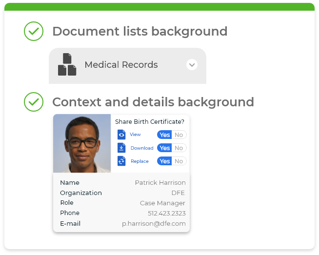
Our color palette changes depending on the user type. It relies on different hues of blue to evoke a sense of balance, calmness and tranquility. Our interface splits into two different color mostly monochrome palettes that differentiate the two main user types on the platform.
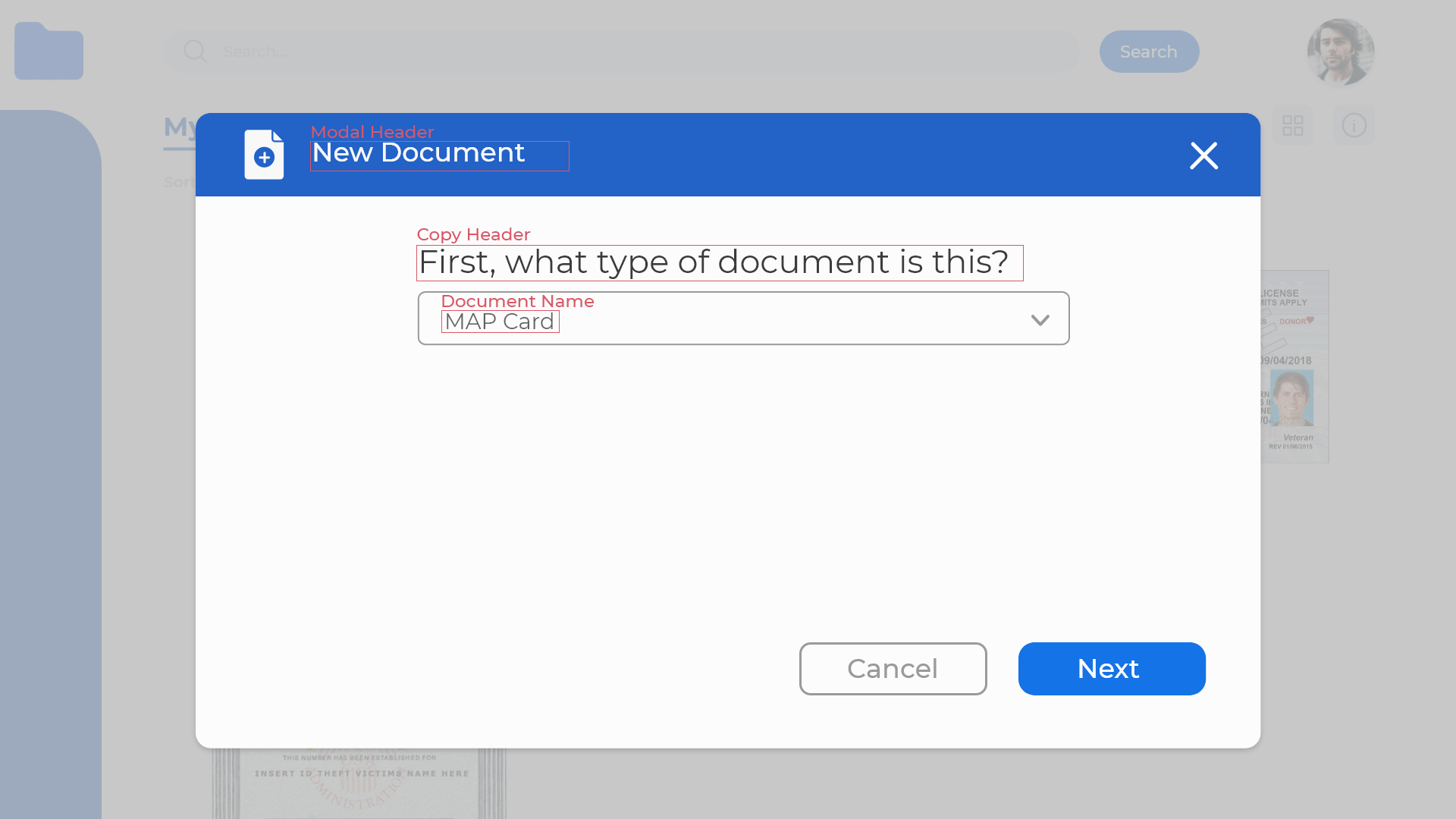
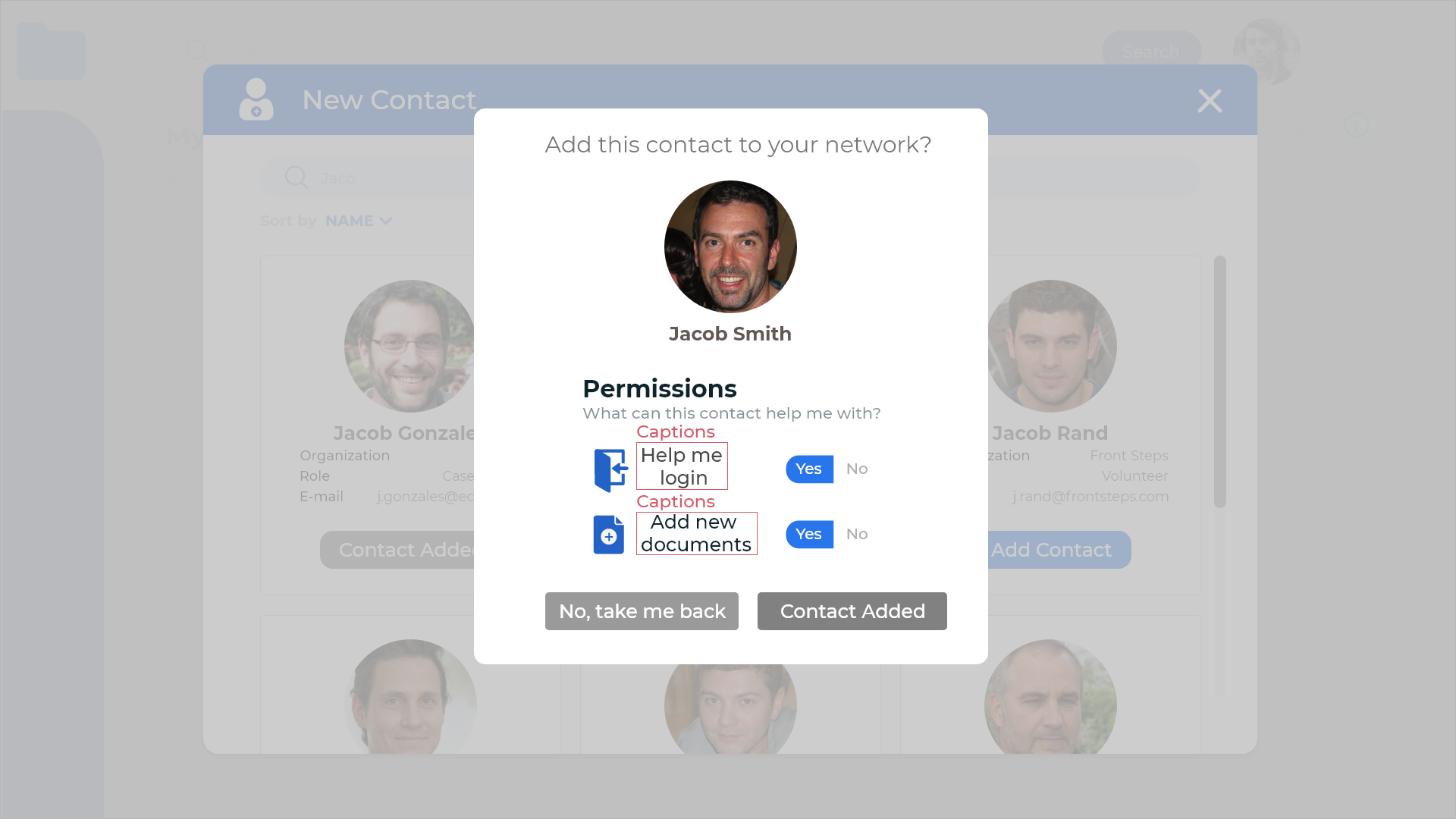
Document Owner

Document Owners use this platform as a way to backup their documents and facilitate their access to services. They are the ultimate authority over how their digital files are stored, who they are shared with and for how long.
Document Helper

Document helpers use this platform to assist documents owners in storing their digital files. Their ability to upload, download, access and print files is conditioned by the permissions the document owners bestow them.
Primary Palette
Fill Colors
Primary colors focus the user's attention to areas of a page and provide a wrapping frame for its comprising elements (i.e. buttons, menus and text). Tints and shades of our primary colors can be used to differentiate between interactions and to provide depth and variation.
Document Owner
Document Helper
Secondary Palette
Pastel Colors
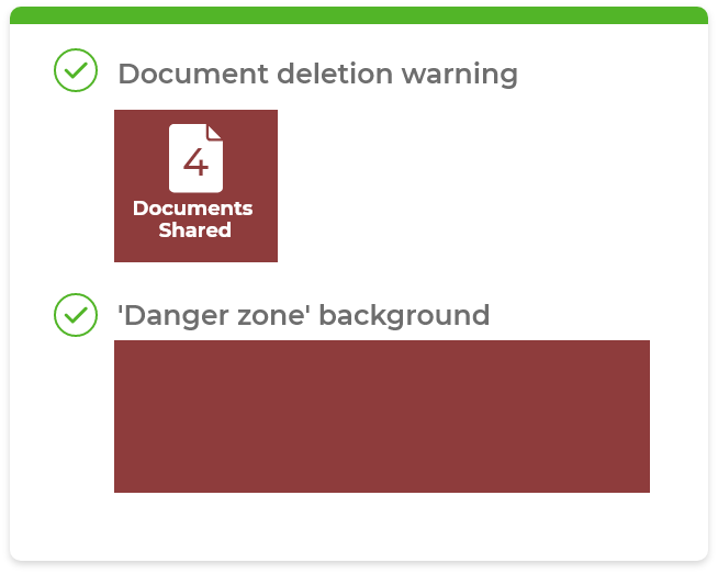
Secondary colors define content types in the system and provide accents on the pages, such as content icons, notifications, alerts, buttons and text fields.
Typography Palette
Grey Colours
Color Usage
Select a color to see where and how to use it
Typography
This platform incorporates a single typeface, relying on size and weights to establish a content hierarchy and create visual patterns that enhance the user experience.
Montserrat
Montserrat is a modern sans serif typeface chosen because of its variety of weights and widths as well as ease of readability.
Sizing and Colors
Depend on the specific context they are housed in. A general rule is to keep font sizes closer to a minimum of 20pts, with few exceptions. This is to avoid alienating vulnerable populations who may rely on this platform to create backups to their documents. People with medical conditions and impaired vision can benefit greatly from greatly contrasting colors and larger font sizes.
Another rule of thumb to consider is font sizes are scaled in linear scale of 4 pts, meaning every increment is done is dividends of 4. For developers and designers, this avoids confusion and facilitates implementation. For users, it polishes and maintains visual consistency and whilst also increasing predictability and in turn, trust.
Tap on the tabs below to see scaling, color and weight options between the different text elements of the UI. While there are exceptions to these rules, those are very rare and only occur where screens have unique constraints or considerations.
Type
Desktop & Tablet
Mobile
Colors


Type
Desktop & Tablet
Mobile
Colors
Type
Desktop & Tablet
Mobile
Regular
Type
Desktop & Tablet
Mobile
Colors
Type
Desktop & Tablet
Mobile
Colors
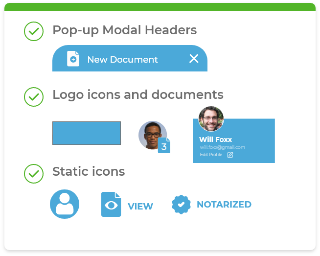
Icons
Iconography is used throughout the platform to supplement text and enhance ease-of-use. It can also draw the user's attention to a specific area of the screen. The guidelines below outline where and how these icons should be used to ensure consistency.
Icon uses
- Primary Navigation
- Indicate Actions
- Identify content type
- Bring attention and clarity to messaging
A custom set of icons is used to identify content type. Below are links for custom SVGs that compile this library.
Content Icons
Content icons are used to help users quickly identify the different types of content in the system. They are primarily used on content cards and content details pages.

Static & Single Use Icons
Some icons are used only once or twice in the application, and have no color variations.

icon-lockedfolder


icon-logoutmobile

icon-usersettings

icon-help

icon-trashcan

icon-copykey


icon-print
Multi-faceted Icons
Some icons have more than one variation. They are used to communicate different features of the platform.
icon-document
icon-downloaddoc
icon-lockeddoc
icon-docinfo
icon-profile

icon-profilepic

icon-profilewhite


icon-palm


icon-palmblue

icon-pass

icon-passwhite


icon-passquestionblue

icon-sheildquestion


icon-secquestionblue

icon-phone

icon-phonewhite
icon-phonequestion
icon-phonequestionblue

icon-tablet

icon-tabletwhite

icon-tabletfaded

icon-tabletblue

icon-laptop

icon-laptopwhite

icon-laptopfaded

icon-laptopblue
Interactive Icons
To illustrate a complex idea, compound icons are used, combining more than one icon or symbol into one depiction.
icon-gridview


icon-gridviewactive
icon-listview

icon-listviewinactive


icon-listviewactive
icon-notifications


icon-notificationsactive
Compound Icons
To illustrate a complex idea, compound icons are used, combining more than one icon or symbol into one depiction.

Static & Single Use Icons
Some icons are used only once or twice in the application, and have no color variations.

icon-lockedfolder

icon-logoutmobile

icon-usersettings

icon-help

icon-trashcan
icon-copykey


icon-print
Multi-faceted Icons
Some icons have more than one variation. They are used to communicate different features of the platform.
icon-downloaddoc
icon-lockeddoc
icon-docinfo
icon-profilepic
icon-profilewhite


icon-palmblue
icon-passwhite

icon-passquestionblue

icon-secquestionblue
icon-phonewhite
icon-phonequestion
icon-phonequestionblue
icon-tabletwhite
icon-tabletfaded

icon-tabletblue
icon-laptopwhite
icon-laptopfaded

icon-laptopblue
Interactive Icons
To illustrate a complex idea, compound icons are used, combining more than one icon or symbol into one depiction.


icon-gridviewactive
icon-listviewinactive


icon-listviewactive


icon-notificationsactive
Compound Icons
To illustrate a complex idea, compound icons are used, combining more than one icon or symbol into one depiction.
Icon Size and Positioning
Icons can generally stand alone or be placed to the left or right of their respective label. Always give the right amount of space around the icon to allow for legibility, especially when this element is interactive so that the user has enough room to click or tap it. Icon size is 20px minimum on mobile and 24px on desktop. The standard sizing for icons can vary but shouldn't be smaller than 20px on mobile and 30px on desktop.
When it comes to sizing, padding and margins, the most important thing to consider is to abide by the spatial system used throughout the design of the platform. When sizing an icon, consider its relationship with its surrounding elements in an 8pt linear scale and scale it accordingly to its available screen real estate and user needs.
See "Layout and Grid" tab for more information on this spatial system
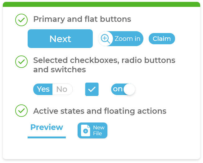
In a button
Horizontal button with caption

Horizontal button with caption and wrapper

Vertical button with wrapper and toggle states

Condensed horizontal buttons with expandability

Toggle states with caption

Floating button

Square button without caption

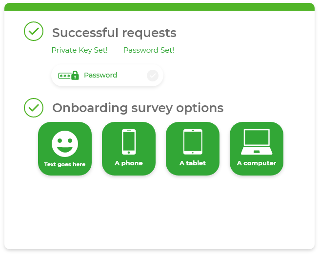
Onboarding login methods (Active/recommended)

In an input field
Right aligned as a button with caption

Left aligned as a supporting icon

In a tab
Centered tab with caption

As a data counter
With caption

With parent element

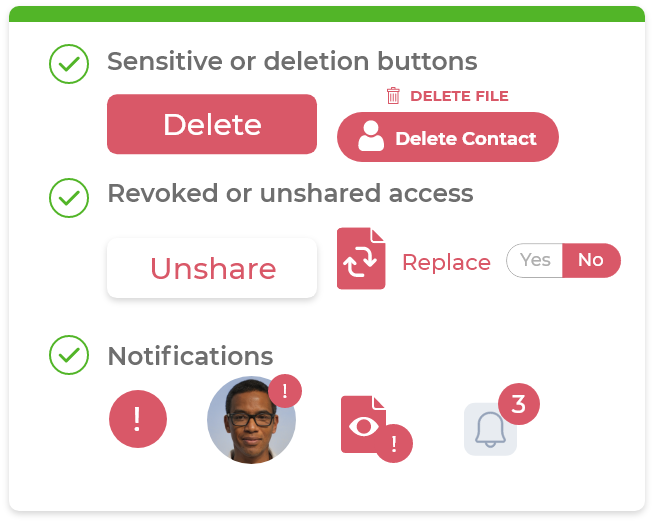
As a notification
General

Numbered

In a header
With caption

In a modal
Centerpiece (supportive)

Centerpiece (informational)

Header (supportive)

Header (supportive)

Icons
Iconography is used throughout the platform to supplement text and enhance ease-of-use. It can also draw the user's attention to a specific area of the screen. The guidelines below outline where and how these icons should be used to ensure consistency.
Icon uses
- Primary Navigation
- Indicate Actions
- Identify content type
- Bring attention and clarity to messaging
A custom set of icons is used to identify content type. Below are links for custom SVGs that compile this library.
Content Icons
Content icons are used to help users quickly identify the different types of content in the system. They are primarily used on content cards and content details pages.
Static & Single Use Icons
Some icons are used only once or twice in the application, and have no color variations.
icon-logoutmobile
icon-copykey
icon-print
Multi-faceted Icons
Some icons have more than one variation. They are used to communicate different features of the platform.
icon-downloaddoc
icon-profilepic
Interactive Icons
To illustrate a complex idea, compound icons are used, combining more than one icon or symbol into one depiction.
Compound Icons
To illustrate a complex idea, compound icons are used, combining more than one icon or symbol into one depiction.
Icon Size and Positioning
Icons can generally stand alone or be placed to the left or right of their respective label. Always give the right amount of space around the icon to allow for legibility, especially when this element is interactive so that the user has enough room to click or tap it. 20px minimum on mobile and 25px on desktop. The standard sizing for icons can vary but shouldn't be smaller than 20px on mobile and 30px on desktop.
Static & Single Use Icons
Some icons are used only once or twice in the application, and have no color variations.
icon-logoutmobile
icon-copykey
icon-print
Multi-faceted Icons
Some icons have more than one variation. They are used to communicate different features of the platform.
icon-downloaddoc
icon-profilepic
icon-palmblue
icon-copykey
icon-secquestionblue
icon-phone
icon-phonewhite
icon-phonequestion
icon-phonequestionblue
icon-tablet
icon-tabletwhite
icon-tabletfaded
icon-tabletblue
icon-laptop
icon-laptopwhite
icon-laptopfaded
icon-laptopblue
Interactive Icons
To illustrate a complex idea, compound icons are used, combining more than one icon or symbol into one depiction.
Active
icon-notifications
Active
Compound Icons
To illustrate a complex idea, compound icons are used, combining more than one icon or symbol into one depiction.

icon-helperpassdevice

icon-ownerpassdevice

icon-notarizeddoc

icon-palmrecognition

icon-facialrecognition
Icon Size and Positioning
Icons can generally stand alone or be placed to the left or right of their respective label. Always give the right amount of space around the icon to allow for legibility, especially when this element is interactive so that the user has enough room to click or tap it. The standard sizing for icons can vary but shouldn't be smaller than 20px on mobile and 30px on desktop.
Spatial System
This platform relies on an 4pt linear scale spatial system. This means every measurement in and around elements of the UI is rendered as a dividend of 4 and scaled according to the needs and functions of its specific layout or screen.

Odd Numbers
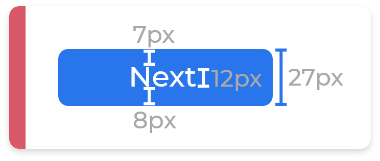
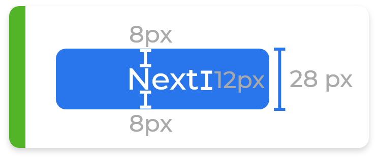
As a general rule: avoid odd numbers. Working with odd numbers can lead to issues with centering elements and pixels. Creating a button with a height of 27 pixels, for example, can create uneven splits in certain browsers or devices. This is especially true when jumping UIs from mobile to desktop screens where its native browser will automatically render scaling properties of 1.5x or other odd multipliers.
Working with a 4 pt scale
There's four attributes where the spatial system comes into play: padding, margin, height and width. Of note here is that sometimes margins and paddings cannot be enforced with a strict height definition. This is especially true with buttons that contain icons of varying sizes or a set font size.
Take a look at the following example...
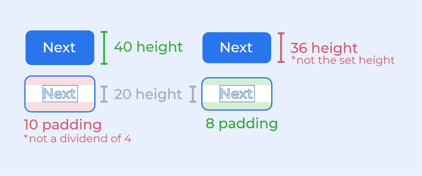
Consider the set height of this button element is 40px and the line-height of its caption text is 20px. However if we were to respect the spatial system and use an 8px padding on the top and bottom, the button will have a height of 36px, not 40px... which brings up the question, which of the two should you prioritize? Internal padding or element size? This depends entirely on what the element and its purpose.
Element first (strict element sizing)
When the content is less predictable in scale and its wrapper needs to occupy the same amount of space on the screen (such as buttons or tabs), then the element's size needs to remain consistent.
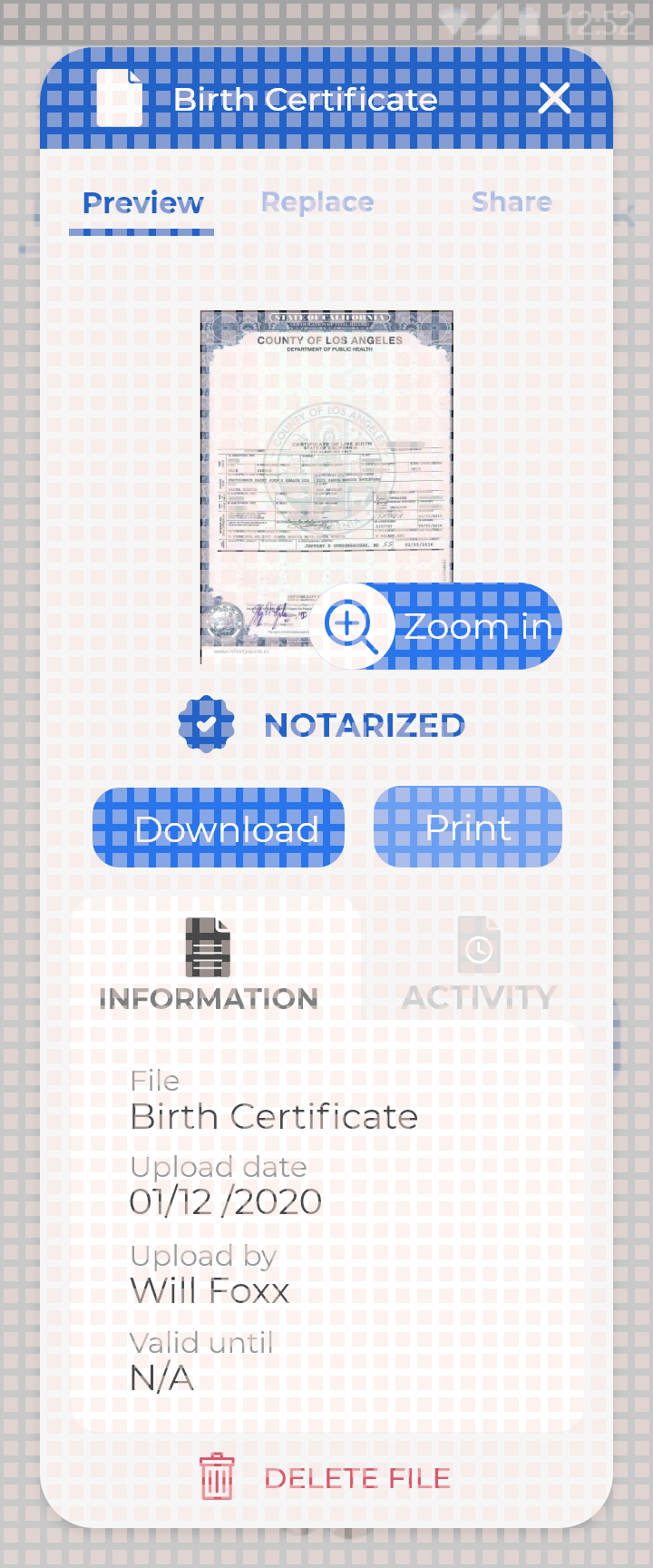
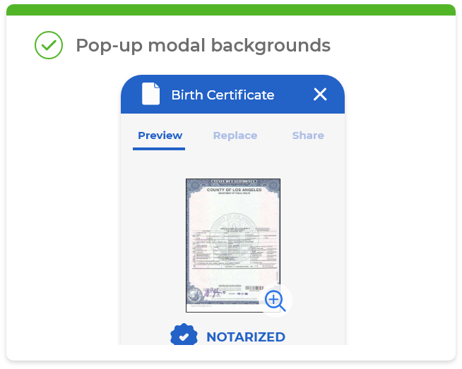
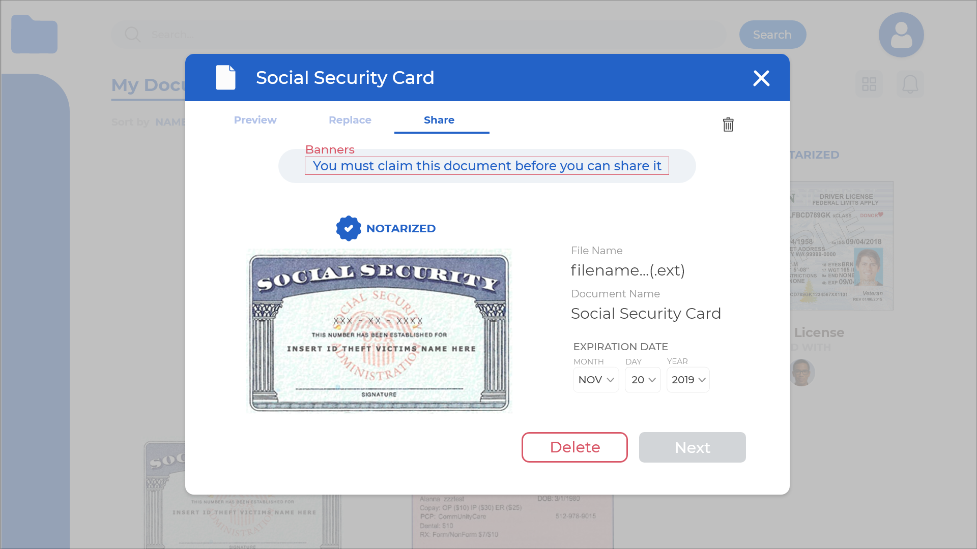
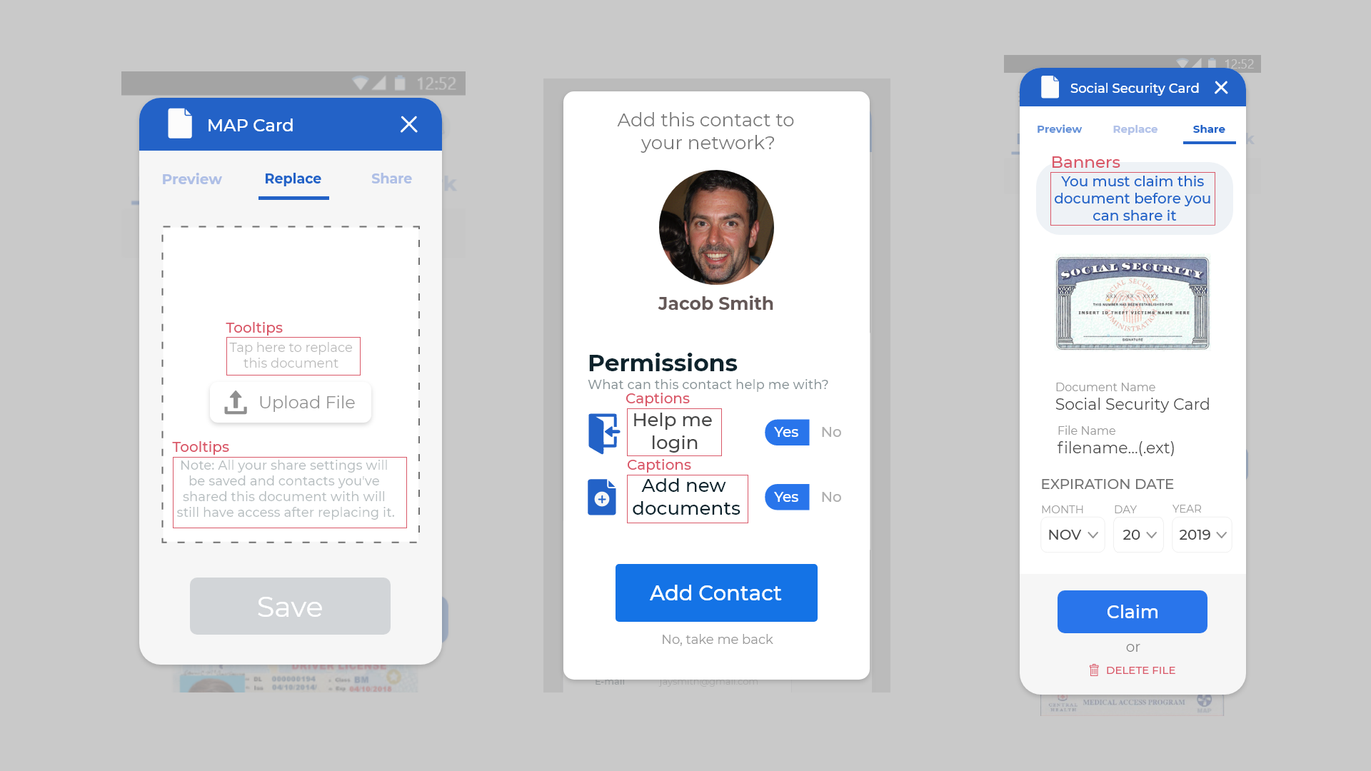
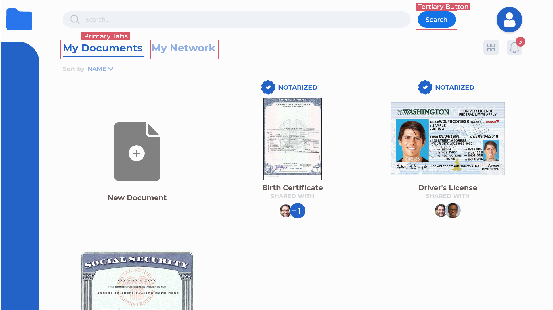
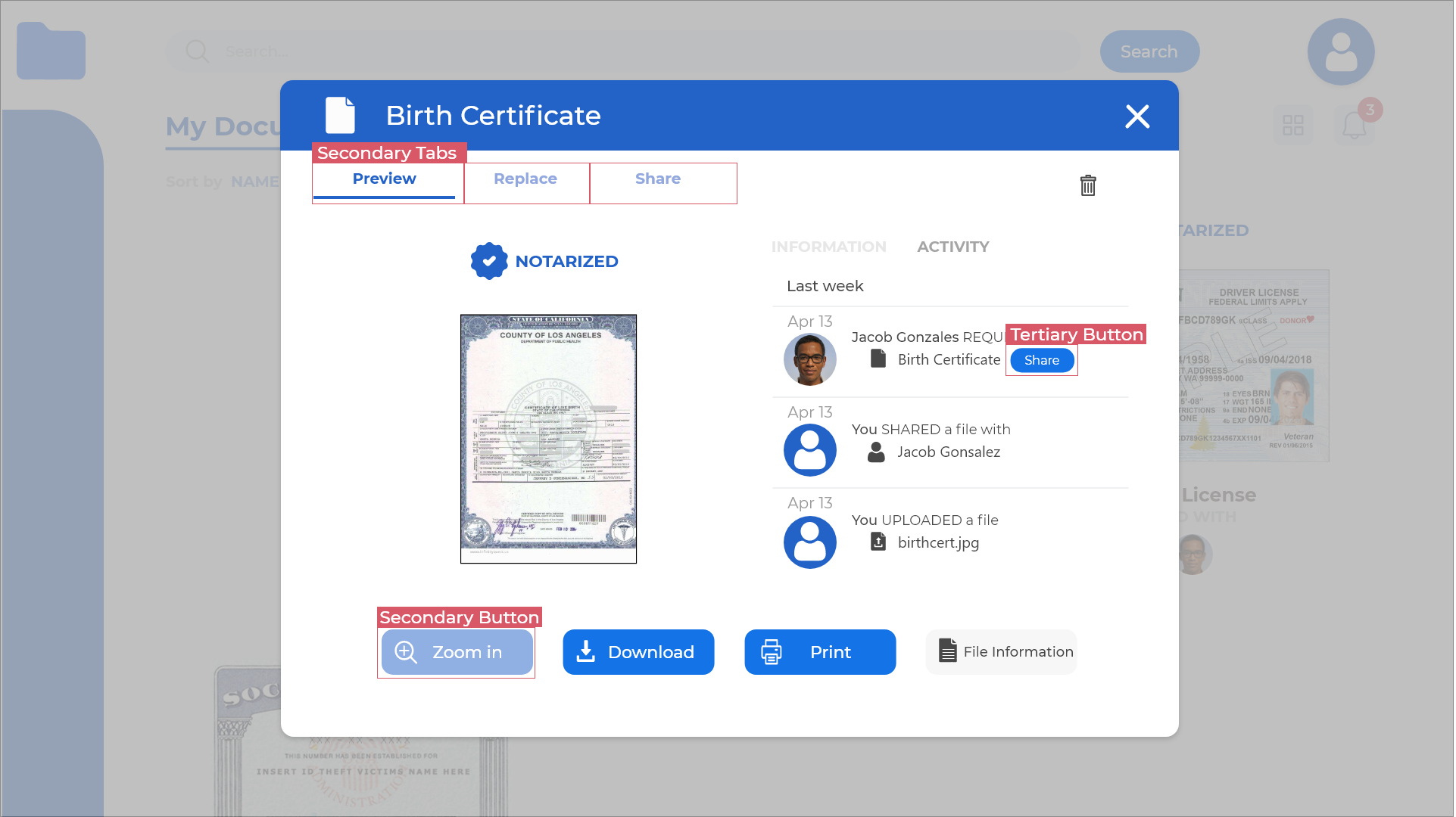
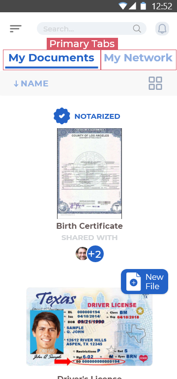
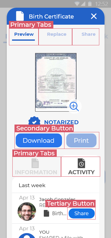
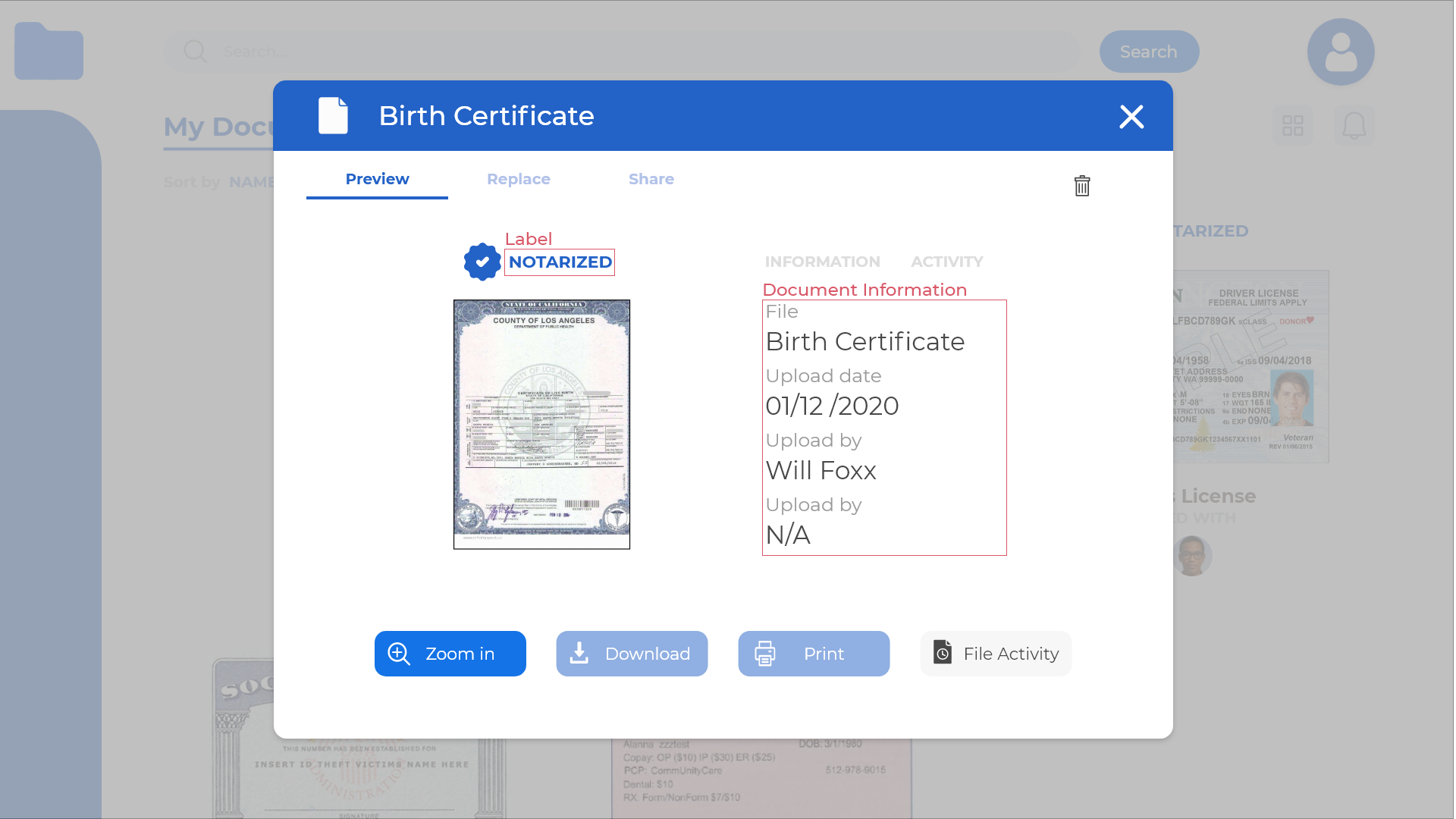
Take a look at the following example. Here we have a desktop screen preview of a notarized document. The actions the user can take are aligned alongside the button of the page as a series of four clickable buttons. By taking the element first approach, you can see the layout is balanced with equally sized buttons that are 60 pixels tall and 200 pixels wide.
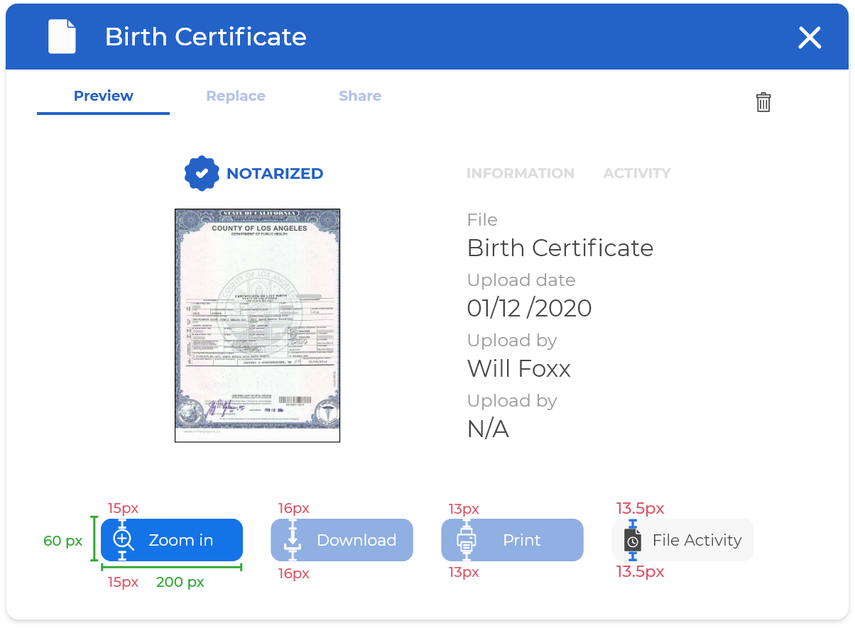
Notice how there are inconsistencies when it comes to padding, marked in red. These cannot be the same because the icons themselves have different dimensions and the words they accompany also have varying lengths.
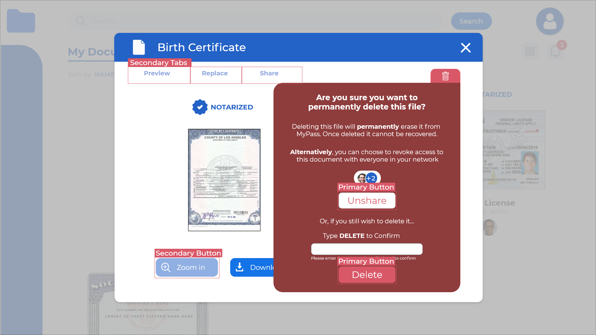
Content first (strict internal padding)
If the element itself is of a repetitive nature or format (such as forms or lists), then it has an inherent quality of predictability. Visual balance can rely on that predictability by maintaining the elements' padding and margin size consistent.
If we were to take the example above and take a content first approach, you can see how these same buttons (while they retain consistent padding) now suffer from huge differences in overall size. This throws a wrench in the overall composition, and impairs the user's experience as they now have to click buttons of different sizes that are spread unevenly on the page.
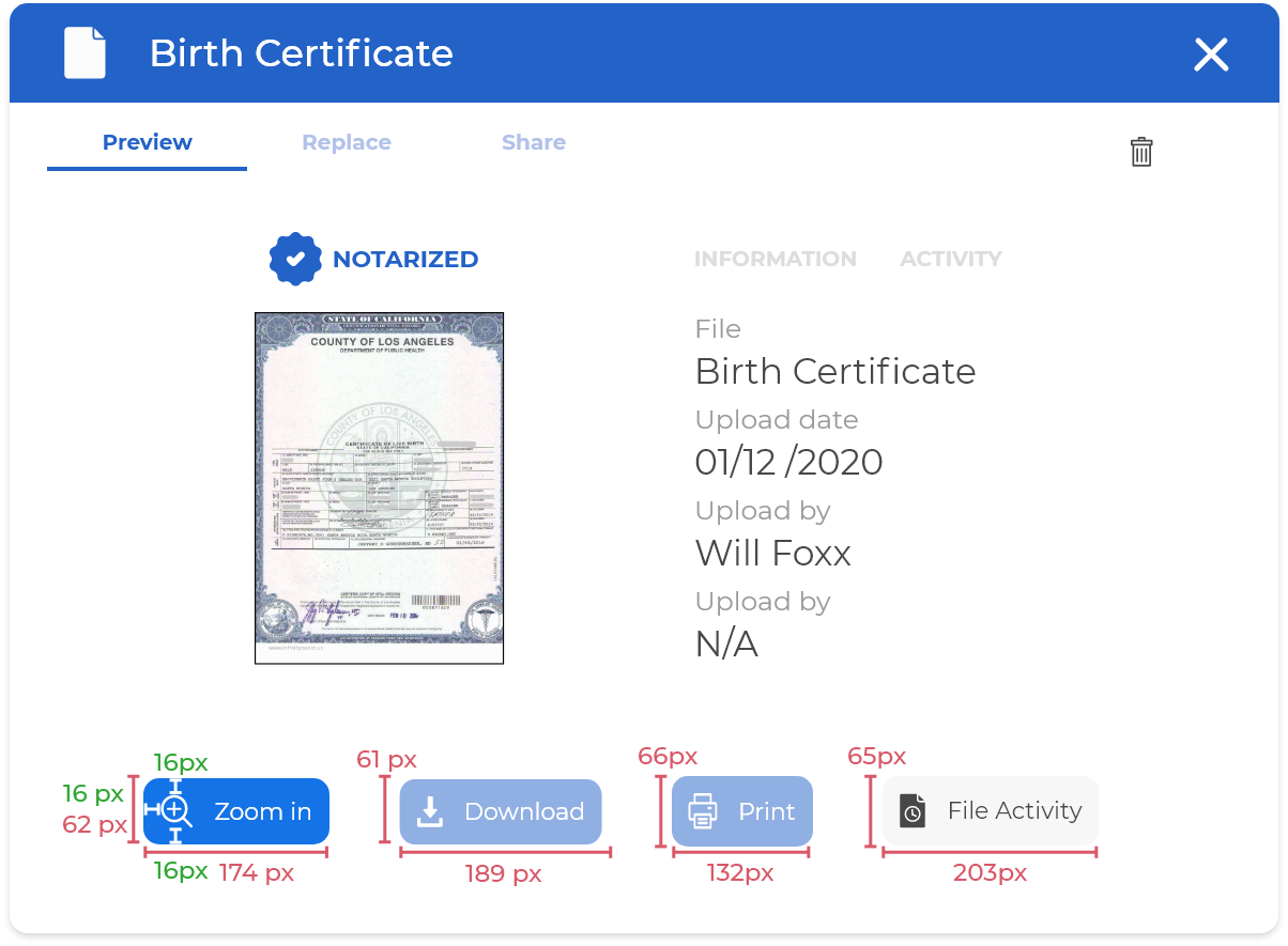
Instead, this approach is much more appropriate when creating tables of user generated content.
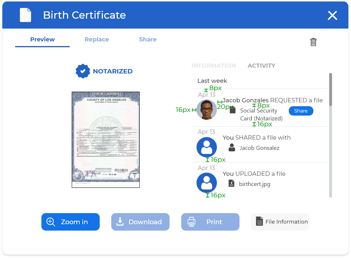
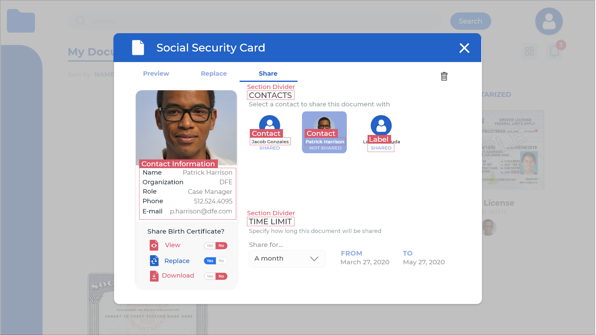
Here you can see how the title "Social Security Card (Notarized)" is long enough to wrap to a second line below. Despite this, the composition remains balanced because the paddings and margins here are prioritized and respected.
Matrix Grid
Grids help structure your content and define the position of every element enclosed within. Here, we rely on a modular grid: a series of columns and rows that organizes content into a matrix structure. Keep in mind this doesn’t have to encompass the entire page layout. Modular grids are an organizational tool and often come with exceptions, especially when it comes to incorporating different font sizes and icons.
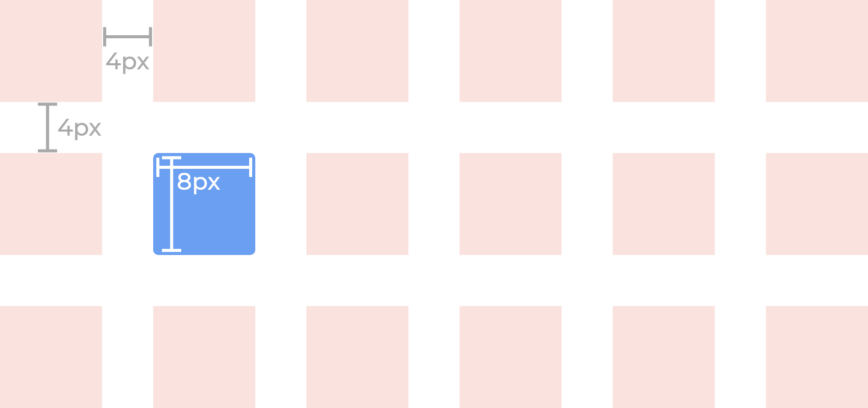
Here is an example of a screen layout designed using this matrix grid. Elements are aligned and spread out between the gutters and squares and distributed in an orderly fashion. Not all elements fit within, and text often overflows, but the most elements align to achieve visual harmony.